
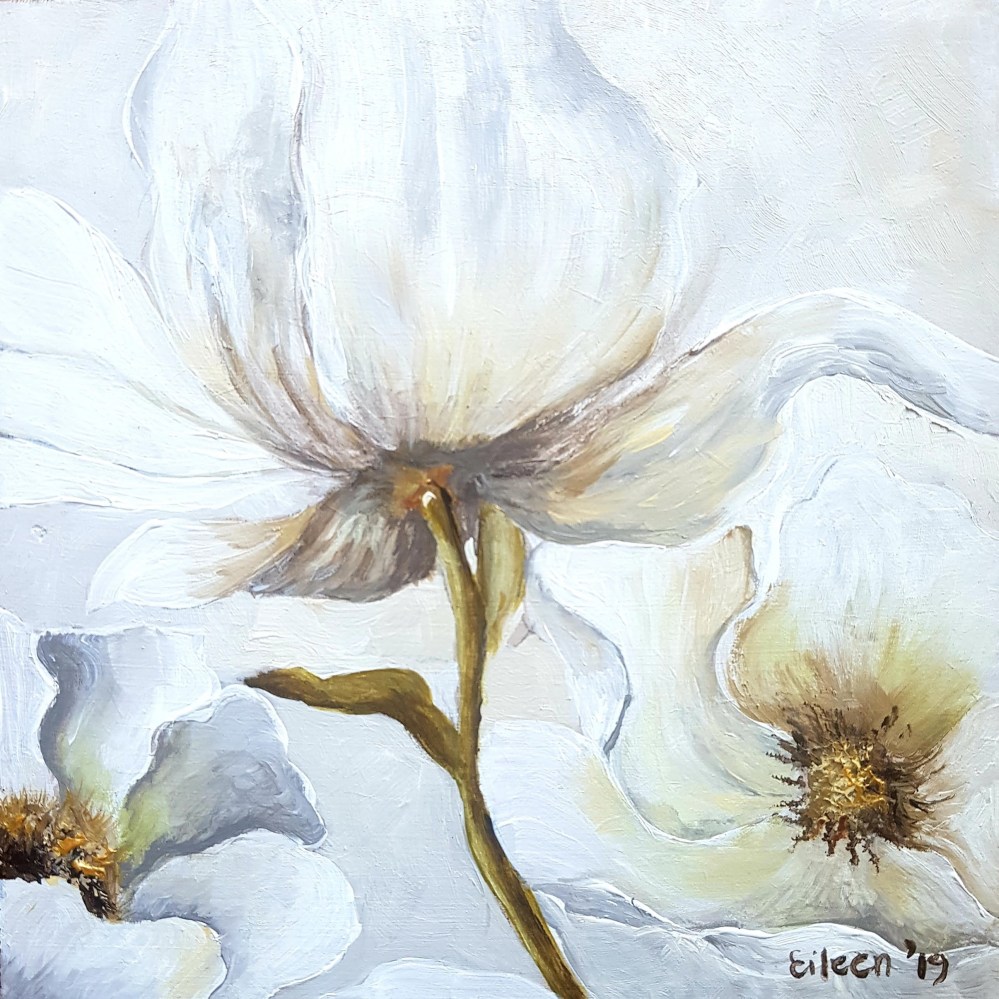
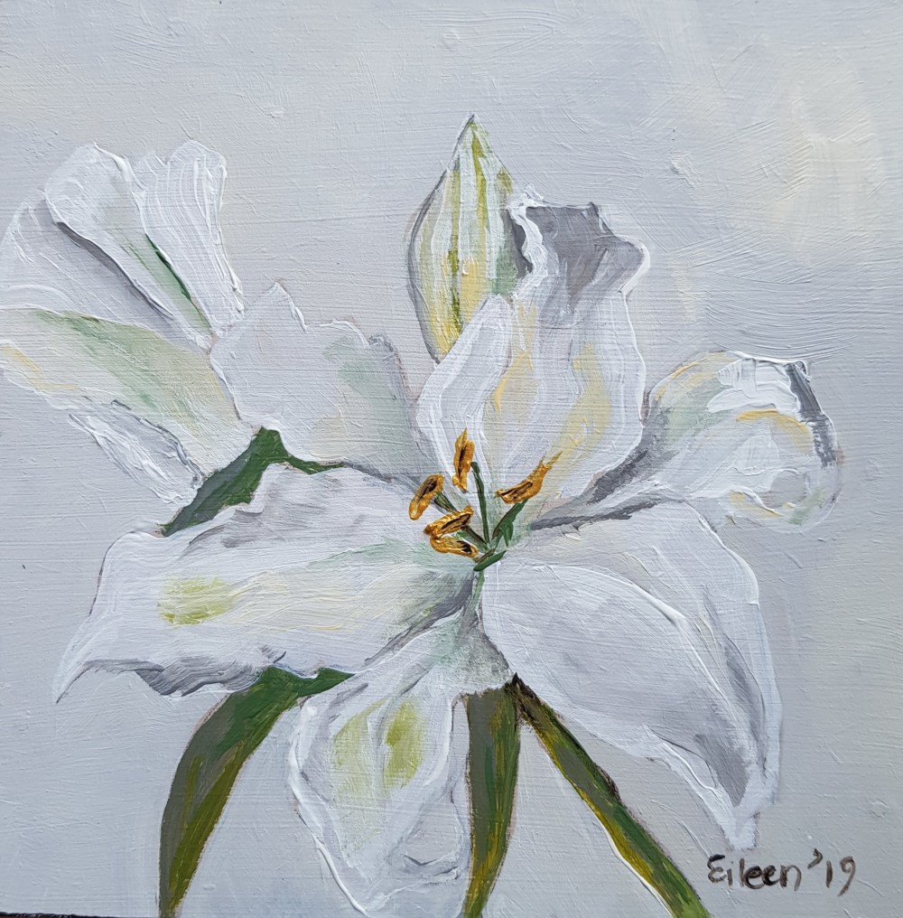
I think a monochromatic colour scheme has to be one of my more challenging exercises. As much as I try to tone down my penchant for colour, it somehow finds itself back onto my palette. I just cannot help myself.
With these paintings I was forced to adhere to very limited variations of white. Monochromatic colour schemes are derived from a single base hue and extended using its shades, tones and tints. Tints are achieved by adding white, and shades and tones are achieved by adding a darker colour, grey or black.
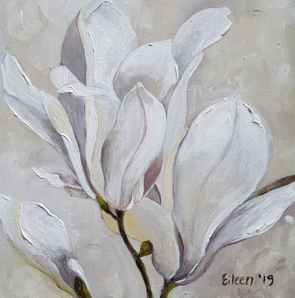
Monochome #1
15 X 15 X 2 cm
Acrylic on board

Monochome #2
15 X 15 X 2 cm
Acrylic on board
Monochome #3
15 X 15 X 2 cm
Acrylic on board
Monochome #4
15 X 15 X 2 cm
Acrylic on board

Lovely as always
Thanks Lyn!
These are super! I especially like Monochrome #3. I tend to use too much colour and make it too saturated so this might be a good exercise for me to try too. Lovely work!
Thank you! I really struggled with this. I kept thinking if I darken the background or add a bit of colour here…… 😂 It was a good exercise of trying to create variations in tone with a very limited palette. I did use grey and sepia in order to create the darker tonal values. It extended the range of the titanium white and buff titanium quite extensively. I also used a bright white in places.
I think they really work!