It has been a while since I had the chance to get involved in any form of painting since our move back to South Africa and coming to grips with a new business. Phil shoulders the greater responsibility and the bulk of the work with regard to our business, but I also needed to learn the ropes and understand the intricacies of what was involved before I could go back to my paints. Almost a year down the line it would seem I am finally able to take a small step back and go back to my paints with only a few hours every morning given over to assisting Phil in the office.

The reference photo
With our return home I have had to pretty much start over, and work at building up a new client base and now, besides getting on with my painting I need to start working at marketing my work while based in a very small village, far from any major centre. In the last year I have had a number of small commissions with regards to botanical drawing and portraits, and a few small paintings, but I needed to start painting again on more complex work, rather than just quick studies. I challenged myself to a landscape of Venice at sunset. It has been years since I have been to Venice, but my memories of the city are still as vivid as the day I saw it for the first time almost 20 years ago!
This is a view across the Grand Canal looking onto the San Giorgio Maggiore on the Island of the same name as the sun begins to set with a gondola in the foreground.

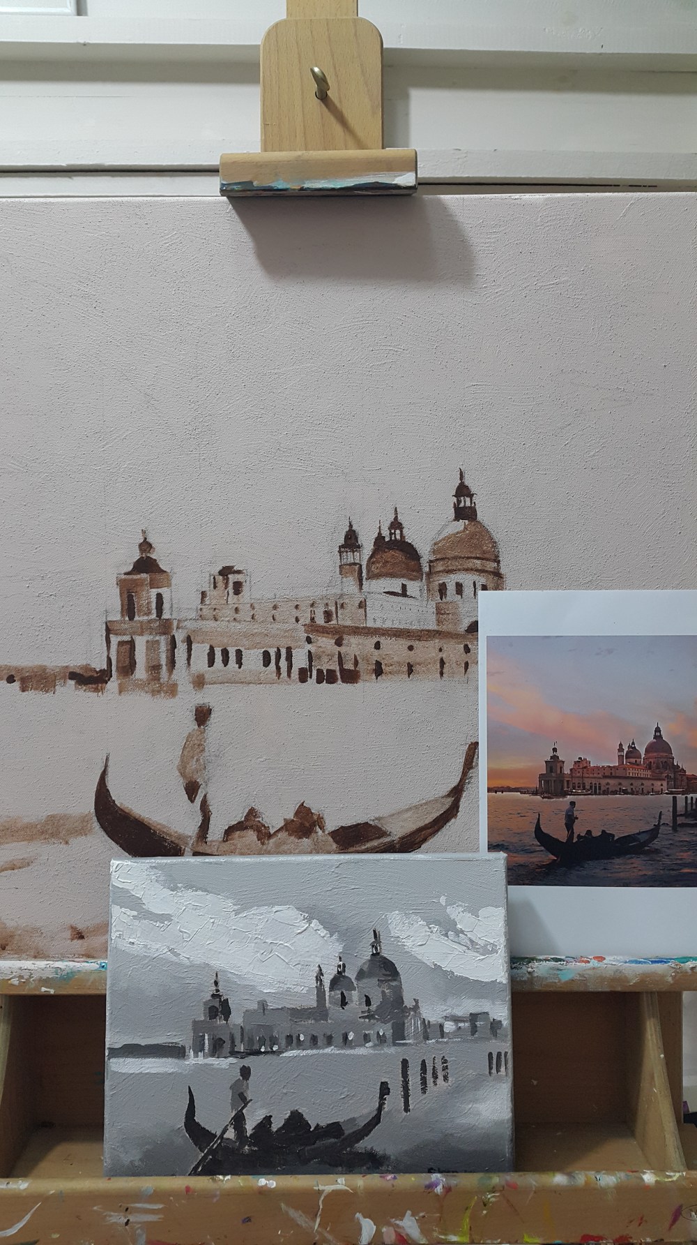
I needed to do some preparation work for this before just starting to paint… I started by doing a small scale tonal study of the painting. By practicing new techniques on small tonal studies before committing to the larger scale piece builds your confidence and helps you intemperate the tonal values that you want to illustrate in your final painting. This allows you to remove unwanted distractions from the photograph you are working from and see the colours more accurately, and by increasing your perception of what you are painting.
That done a prepared the larger canvas. I applied a course modelling paste to the canvas to give it a texture before painting on a tonal ground in pale umber from Windsor and Newton’s Galleria range.

My next step was the transferring of the sketch onto the canvas from a photo and blocking in and colour mixing in preparation for painting my Venice scene. I had to use a very soft 3B pencil so the graphite would stick to the course texture of the modelling paste. I fixed this with a few coats of hair spray (instead of artists fixative, as it works just as well at half the price) so that when I applied the paint I wouldn’t lose the soft guidelines from 3B pencil completely.
Getting the perspective of the building right was a nightmare for me. My engineer son in the end took pity on his mother and drew in a few technical guidelines for me to work with so the building didn’t look like it had been obliterated in an earthquake! Once I had drawn my basic sketch onto the canvas, using burnt umber I laid out the tonal relationships focusing on the darker areas and transforming complicated views into a simple design by blocking in the shadow areas.
Choosing a limited palette saves you endless amounts of painting time. Once I had judged the colours I mixed harmonious colour strings matching the mixes to the photograph I was working from.

This done I used a series of large flat brushes to block in the base colours of the sky and sea using a glazing liquid to smooth the edges blending the colours into one another for a more subtle gradient. I used the flat brush to create more impressionistic brush-marks in the water working the tones downwards thus bringing together the sky and sea.


Glazing adds atmosphere and mood as well as injecting a subtle warmth and glow to the final painting. At this stage it is important to add further details to the architectural elements in the painting using finer brushes, also focussing on the smaller shapes on the gondola, architecture & clouds. This done it was the last few finishing touches using a palette knife to add texture and an impressionistic flair. This done a few tweaks refining the colour mixes, checking the reference drawing and the painting and seeing how the painting works together as a whole. Finally a few select clean dashes of colour to create the ‘silhouette effect’ bringing the viewers attention to certain parts of the painting.
And voila!


I like the textures you put in the sky and water. I was very impressed with the color strings, I would not have thought of that.
Colour strings are something most artists use when painting on a scale like this. Usually with acrylics they dry too quickly for colour strings to be practical, but by using a special stay wet palette it works very well, because it can keep the paint moist and usable for up to 10 days.